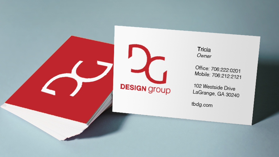
Birthing a new organization


Categories :

I was commissioned by the Georgia Youth Football Association to create the corporate branding for the birthing organization. The need was to communicate youth football organization where teams would travel the state of Georgia in competition.

So I began with the idea to create an identity that could easily be reproduced on paper, shirts, and other marketing material. I chose a sans serif font to offer a high energy modern feel.

Design 1

In design 1 I offered a movement by making the football swoosh out of the state of Georgia. The GYFA are slanted with a gray highlight to give a slight chrome look and 3 dimensional effect.

Design 2

In design 2 I made the football lunge out of the state of star representing Atlanta. The GYFA are outlined with red, white and blue with the Y being contained within the state of Georgia outline.

Design 3

In design 3 I made the football shoot out of a circle of stars. The GYFA are outlined with red, white and blue with the Y being the field goal.

In the end the company wasn’t able to launch because of a lack of financial backing and the project was halted.